I started going through Sharepoint 2013 since the
beginning of last week. This is a preview version.
I had been planning to do a digging around for a month now. Finally, got some mood and time.
Configuration and software in my box
OS: Windows Server 2012 RC x64Spec: 80 GB HD / 8 GB RAM Installed:
SharePoint Server 2013 Preview
Office Professional Plus 2013 Preview
Visio 2013 Preview
SQL Server 2012 Standard
Visual Studio 2012 RC Professional Edition
SharePoint Designer 2013 Preview
Adobe Reader
It looks visually appealing. But otherwise it looks pretty much the
same.
My analysis is that architecture
wise there is not much a change.
I will start with the Central
Administration.
Central Administration Console
It pretty much looks the same, except the extra section for Apps
Now let us do some site browsing.
1) A screenshot of a team site.
2) The Site Actions has been replaced with settings icon on the right top. (I had spent a lot of time figure that).The ribbon is still there.
3) I tried going into the setting pages of the sites(in 2007 and 2010, it was _layouts/settings) by typing into the URL. One
thing I noticed was the inclusion of 15 in the URL.
http://sp2013srv/_layouts/15/settings.aspx
http://sp2013srv/_layouts/15/user.aspx
http://sp2013srv/_layouts/15/ManageFeatures.aspx
http://sp2013srv/_layouts/15/regionalsetng.aspx
http://sp2013srv/_layouts/15/mcontent.aspx
http://sp2013srv/_layouts/15/AdminRecycleBin.aspx (being some of them).
4) In the Site Settings page, I found this different.Search is having its own section in Sharepoint 2013(48x48).I need to figure what that means.Previously Search was under Site Collection Administration itself.
I also tried out some stsadm commands out of curiosity.The stsadm is still there.
The Sharepoint Designer 2013 view screenshot.This is what I saw.
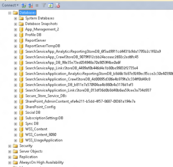
Let us open up the SQL Management Studio to see the databases.

Not much change here too.
At first glance,I feel there is not much revolutionary changes like the move
from SPS 2003 to MOSS 2007 and MOSS 2007 to SP2010.
The changes look more
cosmetic.(like IPhone5 release,but in that case , at least the
performance improvement was huge.)
Yeah...I do think
that the move of Microsoft to move towards implementing social networking
features on SharePoint is kind of successful. MySite does
look like a mini Facebook. :-p
And one more thing to add,SP2013
in my box was slow.The same configuration in SP2010 had better
response.
I will be writing a detailed article on this soon. I
hope my opinion changes to a more positive one J


